Everyone had at least experienced a micro aggression moment in their life. According to Google, "Microaggressions are the everyday verbal, nonverbal, and environmental slights, snubs, or insults, whether intentional or unintentional, which communicate hostile, derogatory, or negative messages to target persons based solely upon their marginalized group"
There were many micro aggression experiences I had in both middle school and high school and probably I would have a few in college too and I wouldn't be surprised or shocked because I've got used to it.
There was one moment in middle school where my class were all playing a type of soccer game and when it was my turn to go I was being my usual self playing soccer and kicking the ball and one of the students shouted, "Let's go Pocahontas!" and I felt a bit offended. But I knew it was a joke but I took it a bit to an offense.
Also there are many experience where people asked where I'm from and before I would answer they would automatically assume, Indian. But when I said Indonesian they were like what is that? When I explained they would be surprised. And so yeah I would have a small feeling that it would happen in college.
Wednesday, April 29, 2015

Monday, April 27, 2015
Why I Love my Darling Family
Many, many years ago my mother and my father gave life to me in 1997 and a few years later after I was born, I would always have trouble eating. I didn't remember anything but every year on my birthday I would hear the same stories over and over again.
When I was around 18 months old I was told that I wouldn't eat a thing. After my family would eat a meal my mom, aunt, and uncle would hold me down by the hands and feet and my mom would force a spoonful of mashed rice, chicken, and veggies into my mouth into my stomach. When I was two years of age, the doctors supplied me with an alternative or what my parents would call a solution to get me to eat. The solution was to get a tube into my nose and every night my mom would fill up my bag transfusion with Pediasure (a toddler's brand milk) and that's how I would get nutrients flowing in my body but I would still be forced food into my mouth.
My parents would try everything from taking me to the park, to the gardens, everyone was trying so hard to keep me healthy. Even the neighbors in my building would suggest ideas for feeding me. Most of the solutions people recommended was not to force me to eat and they knew for sure that I would eat when I get hungry. However, I guess my parents and my family got too concerned about my health that my parents would hold me down to eat just one spoonful of food. My parents also felt embarrassed when my family went out to go to social events with family friends so they would take out the tube out of my nose and dress like a normal toddler.
This changed my life because I realized that everyone loved me and cared for me when I was little and even now. It taught me to be a friendly, nice, and kind person like my parents and it taught me how to respect and treat everyone nicely. this moment in life made me who I am today a person who cares, loves, and respects everyone well especially my family and friends. So thanks to my family and friends for doing everything you can to make me me.
When I was around 18 months old I was told that I wouldn't eat a thing. After my family would eat a meal my mom, aunt, and uncle would hold me down by the hands and feet and my mom would force a spoonful of mashed rice, chicken, and veggies into my mouth into my stomach. When I was two years of age, the doctors supplied me with an alternative or what my parents would call a solution to get me to eat. The solution was to get a tube into my nose and every night my mom would fill up my bag transfusion with Pediasure (a toddler's brand milk) and that's how I would get nutrients flowing in my body but I would still be forced food into my mouth.
My parents would try everything from taking me to the park, to the gardens, everyone was trying so hard to keep me healthy. Even the neighbors in my building would suggest ideas for feeding me. Most of the solutions people recommended was not to force me to eat and they knew for sure that I would eat when I get hungry. However, I guess my parents and my family got too concerned about my health that my parents would hold me down to eat just one spoonful of food. My parents also felt embarrassed when my family went out to go to social events with family friends so they would take out the tube out of my nose and dress like a normal toddler.
This changed my life because I realized that everyone loved me and cared for me when I was little and even now. It taught me to be a friendly, nice, and kind person like my parents and it taught me how to respect and treat everyone nicely. this moment in life made me who I am today a person who cares, loves, and respects everyone well especially my family and friends. So thanks to my family and friends for doing everything you can to make me me.
Monday, March 16, 2015
5 Awesome Book Covers
Here I have chosen 5 book covers that I find interesting and unique:

This book caught my eye easily because of the 3D-ish lollipop popping out of the book. And when I read the title it hooked me more because I would never correlate crime with a red lollipop. I also like the designers choice with the different fonts for the cover. For example, the title and the author have different fonts however the size is really similar. However, the focal point of the book is the red lollipop slammed right in the middle of the cover then your eyes will glance to the title and the author and lastly the quote on the right.

This is another book cover I like because I love the bright color spread across the page. The color really represents the theme and the title. The font of the title and the author also seems garden like. The alignment as well as the interesting font of the author's name really fits in with the theme and comparing to the lollipop cover the size of the author's name is small it makes it seem hidden which is one of the reasons I don't like it because I think it should be a bit bigger. However, I was really draw to this book because of the cool vines and nature around the book and the name and the font of the title makes it even more engaging.

This book cover my first reaction was like "why is there a bed in the middle of nowhere?" and "why is the mattress floating". Looking at this book just arose many many question like "I wonder what this book is about?" or "is it about sleeping or dreams or getting lost in your dreams?" What I find interesting was the the vertical alignment of the words on the cover. The words looked as if it was floating in the sky. I also love the color choice and the reality looking cover. The green grass and sky blue sky catches my eye instantly.

This book's focal point was definitely the egg with the crack on it because it just seemed really weird how an egg is on the cover it also rises many questions and leaded me to predictions of what the book is about or even the title name (before looking at the title of course). I also like the color choice of both the title and the author's name. Yellow is a great color to make words pop up if the background is a deep dark color of course. I also find the choice of alignment interesting I wonder if it would be different if the title and author's name were vertical. The focal point would probably change to the yellow letter bubbles.

I thought this has an strange, unusual, but interesting title and the choice of image they put for the background. When I hear the word porcupine I would think sharp and pointy-like just because I think of porcupine the actual animal. I also like how the title is arranged such as the different color for the "I" and how the letters are all capitalized including the author's name. The pink "I" is the only real color they have since black and gray are really shades. It makes the pink really stand out throughout almost the whole cover. I still find curious on why the designer placed a smooth body with a hand on it, to me representing smoothness and not rough pointy-likeness.
Thursday, March 12, 2015
Hamlet Book Cover Designs
One of my favorite books of all time is Hamlet from William Shakespeare just because Shakespeare's plots were just out of the ordinary. I read Hamlet for Dramatic Literature last year in 2014 of the winter season and I received the book with the cover that looked like this:


If I were at a library and was a human being who was not interested in shakespeare at all, I would honestly not pick up this book at all just because of the simplicity it has. Although we are not supposed to not "judge a book by its cover" we constantly judge it by its cover because our eyes are attracted by color, absurdity, and its mysteriousness.
As I was surfing through the internet I came across an alternative cover that looked like this:
Now this cover will catch my eye because it would catch my eyes. I love the mysteriousness in this book cover. It also hints the ending which is obviously a tragedy. When I see this book I would think of death, tragedy, killing, and blood, and maybe revenge. Although the color may not seem eye popping it seems like it has a specific theme which I look forward to in a book cover and just a book in general.
Wednesday, March 11, 2015


Tuesday, March 10, 2015
My Colorful Midwinter Break
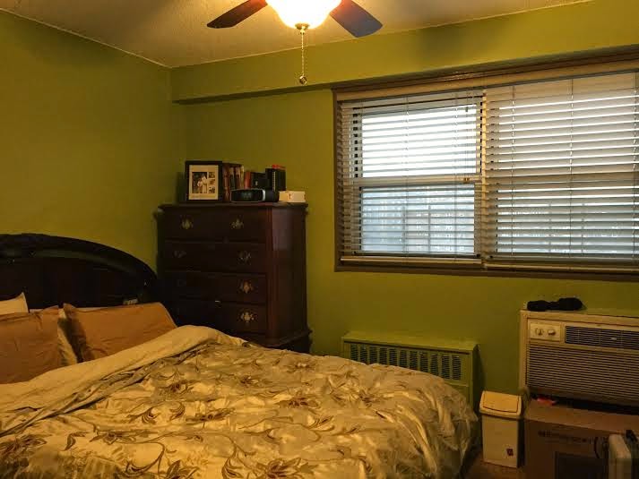
This midwinter break was a really crazy I guess transformation? Because my family and I decided to paint and remodel the whole apartment. And it took us most of the break; Monday through Friday. We thew many things away like cabinets, shelves, bookcases. Although it was difficult to throw a lot of our furniture, the post after modeling was a relief because the apartment looked fresh, new and more spacious.
The hardest part of this experience was deciding the colors for each room. I wanted purple or lilac for my sister's and I room however, she disapproved and said no I want blue and so we argued for a little while and finally I gave up and agreed to have a specific blue that both of us would like. Deciding for the living room was also challenging but fun. Overall, the whole process was really tedious and somewhat annoying.
Everyday during the painting days it was really hard for me to do my homework because all my stuff was packed in boxes that were on top of other boxes. So I started my homework on a friday night where we started to move things back to where they were.
While a close friend of the family was painting I was stuck babysitting our close family friend's son who was a bit of annoying he is one of those kids where you have to keep him busy all the time or else he gets bored and starts throwing temper tantrums. Although I love babies and children, I particularly did not like this one.
One day we would take him to the natural history museum with my sister, aunts and cousins which was really fun because i didn't really need to take care of him as often as I had to do when I was at home. It was also fun to look at all the cool exhibits in the museum.
Well that was all, that's what I did during my midwinter break.
Painting in Process:


Finished Product:
TV Room/ Chillaxing Room

Dining Room


Parent's Room


The hardest part of this experience was deciding the colors for each room. I wanted purple or lilac for my sister's and I room however, she disapproved and said no I want blue and so we argued for a little while and finally I gave up and agreed to have a specific blue that both of us would like. Deciding for the living room was also challenging but fun. Overall, the whole process was really tedious and somewhat annoying.
Everyday during the painting days it was really hard for me to do my homework because all my stuff was packed in boxes that were on top of other boxes. So I started my homework on a friday night where we started to move things back to where they were.
While a close friend of the family was painting I was stuck babysitting our close family friend's son who was a bit of annoying he is one of those kids where you have to keep him busy all the time or else he gets bored and starts throwing temper tantrums. Although I love babies and children, I particularly did not like this one.
One day we would take him to the natural history museum with my sister, aunts and cousins which was really fun because i didn't really need to take care of him as often as I had to do when I was at home. It was also fun to look at all the cool exhibits in the museum.
Well that was all, that's what I did during my midwinter break.
Painting in Process:
TV Room/ Chillaxing Room
Dining Room
Living Room
My Sister's and I's room
Natural History Museum Pictures:

THANKS FOR READING!
Thursday, February 26, 2015
Vocal Club Logo Design Presentation

The most challenging part of this project was getting used to using Adobe Illustrator because I was still confused with all the tools especially using the pen tool which was supposed to be the easiest and common tool to use in Illustrator. Along with the pen tool it was hard to make the microphone with the pen tool because first of all it was hard to make the microphone due to the angles and the music notes were so small and too many lines so I just drew it out with a pencil tool. Although the drafting out was tedious I really enjoyed the process even though it was hard to sketch a variety of ideas.
The most successful part of the project was making a presentation board because I think it was a bit easy to design a project board. First I had to have an idea where to put all the information on the board. I had one separate document with all my requirements for the presentation and then I would rearrange all the objects. Then I would rearrange the objects to where it should be and lastly final adjustments and I was done. I was also successful on creating ideas at first I had two ideas I made on illustrator and although it was hard to pick I asked people for opinion and they choose the one above due to the organization and the simplicity of the objects. Therefore, getting people's opinion helped me a lot throughout the project.
Tuesday, February 3, 2015
A visit at the American Indian Museum
Visiting the American Indian Museum located downtown manhattan was a wonderful and amazing experience. I learned the different traditional headdresses they wore during the time along with the huge handmade jewelry they wore. Many unusual and cool masks were created at the time and some were really simple but some were more complex then other masks. For example, one mask I found interesting was the Ooger Uk Inua made by Larry Beck in 1982.


This mask was really interesting because it was made up of only tires and kitchen utensils and maybe a bit of glue here and there but still it was so surprising how things around your home can be made into a mask. I shouldn't thought of that when I was making my Oedipus mask for my English project. Beck was interested in Yup'ik masks and he decided to experiment with found objects and make it into a somewhat mask. According to the caption of the sculpture/mask this mask represented American pop sculpture but did maintain its masking traditions and elegance. This I found was impressive and interesting because in my opinion it didn't really look elegant but did look neat. Around this piece of art was also many other sculptures and masks tat were created from other artists.
Another piece of art that I found interesting was a war shirt made out of photographs and film strips with glass beads, metal and plastic.
I was just surprised that this was a shirt, I mean how would you wore this shirt made out of photographs? I thought that the photographs somehow connected it was all in the same scenery and setting. The dangling film strips reminded me a cowboy's vest. Bentley Spang created this sculptor and like his ancestors he used materials that served and honored his family and culture and his artwork helped define his personal identity. I thought his artwork were really sentimental that were made with interesting materials.
Monday, December 22, 2014
Finding Typefaces Near Me

This typeface is script because all the letters connect. This specific typeface is for advertising and this can be used for all Lush products. The specific typeface was appropriate for advertising. Specifically,
for advertising cosmetics like lotion, bath products etc.

The typeface of "Poland Spring" is really funky therefore I think this can be fringe typefaces due to the different designs of each letter, like the P in "Poland"and the "g" is also different. This typeface brings the customers attention; big, bright, and bold. It's also outlined in green so it stands out more. And I feel that it is appropriate however I feel like the proportions were all different it was too much for me.

The typeface in "Biology" is all capitalized and has serifs therefore I believe it's slab serif the serifs are not slanted they're straight. This typeface can be found in more professional use like a school textbook. It is appropriate for students to see and it's not very distracting, it's very simple and can be used for professionalism.

Similar to the above typeface it's also slab serifs due to the straight serifs. Wells Fargo is a bank so their typeface should be professional and eye-catching for clients or customers could see. San serifs typefaces can be found anywhere where it is both professional and advertising that is appropriate for both uses.

I think this is a decorative typeface because the letters are unique where it doesn't have one constant style. The customer can easily tell that the "K" in "Skim" is more unique from all the other letters. I think it's appropriate for the customers and buyers because the letters are eye-catching. The typeface is appropriate for advertising. You can probably find this everywhere around you local grocery stores.

This is similar to the first typeface we looked at which is script because the letters all connect. This is also appropriate for customers and business because it's for advertising. The script catches peoples' attention which is great for businesses. Although the typeface is script, its easy to read and is simple. These simple but engaging and elegant typeface can be found in all department stores, outlets, and grocery stores.
Friday, December 19, 2014
A typeface that represents me...

I think this typeface represents me for most days because if you know me well, I am usually crazy, bubbly, hilarious, and positive. I like to make people laugh and smile a lot and I feel like the size of each letter are different and I feel like I have so many emotions jumbled up inside of me that each letter represents me and each letter has some craziness added on to it. The name of the type face represents me because "skater girls" are usually adventurous and I love hanging out with my friends and family and going to wild places.
Thursday, December 18, 2014

Vocal Club at Millennium High School
Hello Everyone!
I am currently working on a project called the Logo Design Project where I have to create a logo design for a club or an after school activity. I chose vocal club so here is a brief summary of vocal club.
Summary:
Vocal Club was founded by a sophomore in high school but was lead and taught by a former senior from Millennium High School that now goes to FIT. She taught them vocal warm-ups from a vocal warm up sounding like an old man to a an ambulance siren. The highlight of each vocal club session are the solos they constantly do in every session. Interestingly, they have different themes for different weeks for example, Christmas week or Disney week. These themes help them choose songs they would sing like during Disney week you sing Disney songs from broadway plays or even disney movies. Vocal Club is now in their second year anniversary. Nothing special just more and more themes. Their current leaders are now the seniors in Millennium; Kate, Cody, and Annisaa (myself). Along with the facilitator of the group which is a Spanish Teacher at Millennium, Ms. Tyldesley. Not only do they do solo performances but they also have rhythm, duets, and sing-alongs!
Interview with Kate:
Questions and Answers:
1)What's one thing you would like to include in a logo?
A music note
2) What's the best part of vocal club?
Getting to do what you want to do along with the support.
3) What's the emotions you have when your in vocal club?
Fear, joy, and excitement.
4) What represents vocal club?
Microphone, lyrics, people.
5) Do you recommend people to go to vocal club?
Yes, if they like singing they definitely should!
I am currently working on a project called the Logo Design Project where I have to create a logo design for a club or an after school activity. I chose vocal club so here is a brief summary of vocal club.
Summary:
Vocal Club was founded by a sophomore in high school but was lead and taught by a former senior from Millennium High School that now goes to FIT. She taught them vocal warm-ups from a vocal warm up sounding like an old man to a an ambulance siren. The highlight of each vocal club session are the solos they constantly do in every session. Interestingly, they have different themes for different weeks for example, Christmas week or Disney week. These themes help them choose songs they would sing like during Disney week you sing Disney songs from broadway plays or even disney movies. Vocal Club is now in their second year anniversary. Nothing special just more and more themes. Their current leaders are now the seniors in Millennium; Kate, Cody, and Annisaa (myself). Along with the facilitator of the group which is a Spanish Teacher at Millennium, Ms. Tyldesley. Not only do they do solo performances but they also have rhythm, duets, and sing-alongs!
Interview with Kate:
Questions and Answers:
1)What's one thing you would like to include in a logo?
A music note
2) What's the best part of vocal club?
Getting to do what you want to do along with the support.
3) What's the emotions you have when your in vocal club?
Fear, joy, and excitement.
4) What represents vocal club?
Microphone, lyrics, people.
5) Do you recommend people to go to vocal club?
Yes, if they like singing they definitely should!
Wednesday, December 17, 2014
Logo Designs

I found this to be my favorite design because it's yet so simple and recognizable. It's also really clever on how their company is called Apple and they just use a simple apple for their logo. The first apple logo was a colorful logo but as time passed logos became more modern and more tech. After the new updated logo design of a glowing white or silver apple, their technology also became modern and most of its colors were simple colors like silver and white or even black. Apple is now known as a brand mark.

I found this logo design really cute because the company decided to have a letter to represent an animal from the antarctic. The typeface is really simple too! Simple is cute is a nice combination.
Wednesday, December 10, 2014
Portrait Transformation Project
Before Photoshop:

After Photoshop:

Concept: I just wanted to be silly and do cool transformation to a human and dinosaur fossil head. Perhaps the concept would be how wild my friend is and she makes time worth it. She is an adventurous and brave girl who is not afraid to do anything. She also has a bucket list so maybe the fossil head can represent that she will be adventurous to finish up and check off everything off her list before she dies. Wooh! Tbh I didn't really know where I was going with this. Haha! :D
Wednesday, November 19, 2014
Water Gif and Reflection

Water Gif:
The symbol of this gif symbolizes how in society today we don't take our clean and pure water for granted and how we don't take in consideration on how we are putting our wastes in our 1% clean water. It brings awareness that people in our society should take care and love their water, before it gets too late, before the water is all gone. Water is essential to you and the other organisms around you so try to change your water routines. One small change is the first step to a bigger change.
Reflection:
The most frustrating aspect of making this gif was the color difference in all the layers and frames because it was hard to portray the difference between clean and dirty water, full of chemicals and substances that are not supposed to be in our water. At first I thought I should use a bright blue for clean water by as I went on making the other layers, it was hard for me to figure out the process to show dirty water.
The most difficult part was trying to find smooth transitions that shows the difference of the water as the gif goes on. Tweening the gif was a challenge because after I tweened it, it looked a little awkward because as the water levels were decreasing the cup or glass was disappearing. So I had to go back up delete all the frames and retween. However, the tweeing wasn't the problem the amount of tweening and the opacity was the problem. My opacity for the tweening was 50% which caused the cup disappearing. Along with the opacity, not everything had to be tweened, I figured that only the water transitions had to be tweened. And that is how I solved the whole transitioning problem.
The tools that I feel the most comfortable with a few tools such as; the marquee tool, the lasso tool, the paint brush tool, the paint bucket tool just because I used those tools the most. However, I don't feel comfortable with the gradient tool which I feel like that if I knew how to use the gradient tool the project would be completely different with actual clear water transitioning to brown water as well as a 3D shape glass or cup. That would be one thing I would change if I were to redo this project.
I would like to create more gifs and get to know photoshop more to be more familiar with all the other different tools. And also transform images to different images would be cool to.
Sunday, October 26, 2014
My First Gif
Tabasco falling! Don't worry there might be better Gifts coming soon!
I was just having breakfast and they served mini Tabasco bottles so I decided to make this!

Tuesday, October 21, 2014
Michael Johnson Concept Board

Summary:
Michael Johnson had a rough time during his early stages of being a designer for example, he was “bullied” while working for Wolff Olins, and after he got back up on his knees and founded a design studio that created brands for huge companies such as virgin atlantic, museums, and even bands like the The Beatles. So I really loved how even though he did have a rough time in his life he ignored what people said and kept striving for his goals. He really impacted society because it helped society create brands as well advertise them everywhere around the world. It also helped individuals to strive until they achieve your goals.
Wednesday, October 8, 2014
Good Advertisement

There are many advertisements in America and even in the world, from billboards to a piece of candy wrapper. But what does good advertisements look like? Well what are some of the qualities of a good Ad?
Here are some of the good qualities of an Ad:
- Eye catching
- Color contrast
- Words or phrases
- Known
- Gives out a message.
Above is an example of good advertising I found in the subway station at the 4 or 5 station in Bowling Green. I find this good advertising because the brand, "Samsung" is really popular, a popular phone brand and so therefore, it is known to the country and world on what their specific logo is, in consideration to their font. The slogan, "Do you note?" is really catchy because they incorporated the device name into their slogan. It also tells a message about a new device and it gives us a glimpse of it, which is meaningful because it informs the audience about their new technology. Which not only makes it a good Ad but a successful one too!
Friday, October 3, 2014
My Playwriting Inspiration
As I have told you before in my posts about my interests of playwriting one of my inspirations is William Shakespeare plays: Romeo and Juliet, Hamlet, Midsummer's Night Dream, and Othello. Those are just my favorites.

My favorite quotes are:
"Everyone has their fate and the more people try to avoid it, the more trouble they get into." (Shakespeare, Romeo and Juliet)
"Doubt thou the stars are fire; Doubt that the sun doth move; Doubt truth to be a liar, But never doubt I love..." (Shakespeare, Hamlet)
I was inspired by Shakespeare since 8th grade, however I started my passion of playwriting in ninth grade. Due to my playwriting program called 3Thursdays which is an amazing program where you have the freedom to write about anything. And after I finish writing they performed it with professional actors.
One of my favorite plays I wrote was inspired by Shakespeare because I based it off of Romeo and Juliet but its more of a modern version due to the different religion of Christianity and Islam. However, I also incorporated more modern themes and social issues.
One of the reasons why Shakespeare inspire me is because I realize his work is so popular and so unique in different ways that its really interesting to try to recreate a play where it can be based off his idea. However when using his ideas you try to go on other paths because you can alter plays however you like. Which is one of the reason why I love writing in general especially playwriting.
The reason playwriting is the right style of writing for me is because I love how the formatting can be varied in different ways such as the Shakespeare how the character's name is on the left side or how its formatted now; character's name written in the center of a line.
Shakespeare's plays are always inspiring to so many different people, and its all awe-inspiring in many ways like how I started to incorporate similar ideas to my play. Or just how unique and tragic his plays usually are which is why I love Shakespeare' outstanding themes, ideas, and plots.

My favorite quotes are:
"Everyone has their fate and the more people try to avoid it, the more trouble they get into." (Shakespeare, Romeo and Juliet)
"Doubt thou the stars are fire; Doubt that the sun doth move; Doubt truth to be a liar, But never doubt I love..." (Shakespeare, Hamlet)
I was inspired by Shakespeare since 8th grade, however I started my passion of playwriting in ninth grade. Due to my playwriting program called 3Thursdays which is an amazing program where you have the freedom to write about anything. And after I finish writing they performed it with professional actors.
One of my favorite plays I wrote was inspired by Shakespeare because I based it off of Romeo and Juliet but its more of a modern version due to the different religion of Christianity and Islam. However, I also incorporated more modern themes and social issues.
One of the reasons why Shakespeare inspire me is because I realize his work is so popular and so unique in different ways that its really interesting to try to recreate a play where it can be based off his idea. However when using his ideas you try to go on other paths because you can alter plays however you like. Which is one of the reason why I love writing in general especially playwriting.
The reason playwriting is the right style of writing for me is because I love how the formatting can be varied in different ways such as the Shakespeare how the character's name is on the left side or how its formatted now; character's name written in the center of a line.
Shakespeare's plays are always inspiring to so many different people, and its all awe-inspiring in many ways like how I started to incorporate similar ideas to my play. Or just how unique and tragic his plays usually are which is why I love Shakespeare' outstanding themes, ideas, and plots.
Letter Project Reflection
In my letter art project, I chose the letter "S" because my last name, Sularno, starts with the letter S and I felt like my surname is really meaningful to me because my dad side of the family including my extended family have similar surnames for example, my cousin's family has the surname of Suharno and my other cousin's name is Sunarno. And so I decided to incorporate family and memories and so I thought I hard while I was brainstorming.
Finally, I decided to choose my childhood memories to base off my art project. After brainstorming thumbnail sketches, I choose two of my favorite designs. One of my favorites was where I decided to draw a playground theme. And the other design I chose was a design based on the theme of school and hardworking. However, during the process of drawing our rough drafts I chose the playground theme because I felt it was much easier and more fun to draw with all the colors.
Within that playground theme I choose the most important essentials for a playground, for example, slides, monkey bars, and swings. Before I drew the playground essentials, I drew grass around the "S" on both sides and I decided to color it with different shades of green and drew a line of the "S" with dark brown color pencil. (All of the materials I used is color pencils and pencil for my first draft) After I drew all the grasses I drew all the playground essentials with a variety of colors to make it pop and be really child-like.
I felt that this process was really helpful especially when I had to brainstorm different themes and ideas that deal with "S". I also like how at first it was really hard to decide which design to choose. So Ms. Lee solved that by choosing two ideas and drawing them bigger. And that was how I chose which design to finalize.
Which looks like this: (This draft was first drawn by pencil then colored by color pencils)

One of the struggles I had during this process was having to draw the different playground essentials as well as deciding the colors to choose for it. This is because there was a lot of parts to it, for example, the slide had the rooftop, the bars, the stairs, and the actual slide itself. Also when looking at all the examples of slides from google it was hard to agree to which colors or designs to use therefore, I just went to my childhood and imagine the playground there.
I am actually very satisfied with my project however, one thing I would change is making the "S" larger and the park essentials also larger to make it pop more. Also when making my park essentials bigger I would make the children I placed in the playground bigger with a lot more details.
This is my final draft:

Finally, I decided to choose my childhood memories to base off my art project. After brainstorming thumbnail sketches, I choose two of my favorite designs. One of my favorites was where I decided to draw a playground theme. And the other design I chose was a design based on the theme of school and hardworking. However, during the process of drawing our rough drafts I chose the playground theme because I felt it was much easier and more fun to draw with all the colors.
Within that playground theme I choose the most important essentials for a playground, for example, slides, monkey bars, and swings. Before I drew the playground essentials, I drew grass around the "S" on both sides and I decided to color it with different shades of green and drew a line of the "S" with dark brown color pencil. (All of the materials I used is color pencils and pencil for my first draft) After I drew all the grasses I drew all the playground essentials with a variety of colors to make it pop and be really child-like.
I felt that this process was really helpful especially when I had to brainstorm different themes and ideas that deal with "S". I also like how at first it was really hard to decide which design to choose. So Ms. Lee solved that by choosing two ideas and drawing them bigger. And that was how I chose which design to finalize.
Which looks like this: (This draft was first drawn by pencil then colored by color pencils)
One of the struggles I had during this process was having to draw the different playground essentials as well as deciding the colors to choose for it. This is because there was a lot of parts to it, for example, the slide had the rooftop, the bars, the stairs, and the actual slide itself. Also when looking at all the examples of slides from google it was hard to agree to which colors or designs to use therefore, I just went to my childhood and imagine the playground there.
I am actually very satisfied with my project however, one thing I would change is making the "S" larger and the park essentials also larger to make it pop more. Also when making my park essentials bigger I would make the children I placed in the playground bigger with a lot more details.
This is my final draft:
Subscribe to:
Posts (Atom)